Andy Theme: Your Key To A Profitable Online Store With A 100% Focus On Sales
A profitable online store consists of multiple components: a winning niche, a competitive product offer, and of course, a user-friendly and purchase-motivating layout. Today, we’ll talk about one of these aspects in more detail.
What do you want from your dropshipping store?
Well, in general, you want it to be good-looking, attractive to visitors, easy in use and management…
But, most importantly, you want it to be profitable.
You didn’t start this business to just pass the time or whatever. You’ve become a dropshipping store owner because you wanted to make some money online.
And that’s what we want to help you with!
To help you convert as many store visitors into buyers as possible, we’ve created a brand new store theme: here’s Andy!
What makes Andy the perfect theme for building a profitable online store?
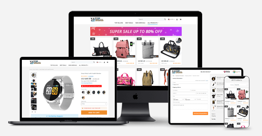
Okay, let’s take a closer look at the Home page of an Andy-based store.
What’s the first thing that grabs your attention?
The page just SCREAMS ‘Buy Now!’, right?
What did we do to achieve this effect? Let’s go over all the details one by one.
-
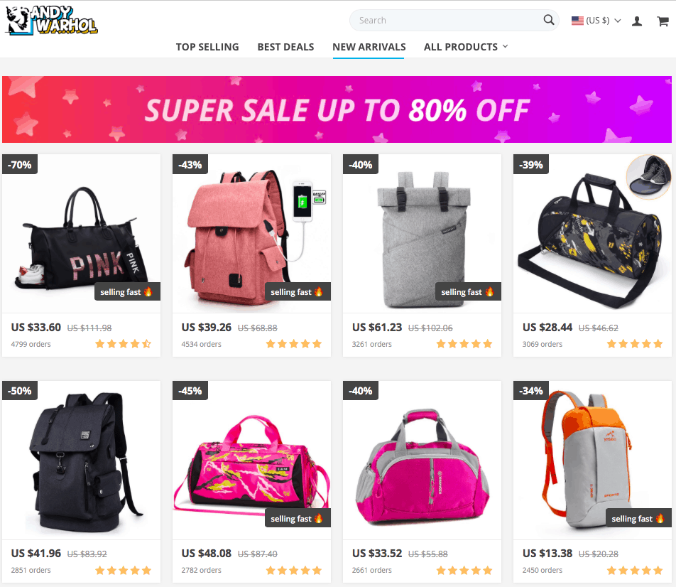
Persuasive banner
Basically, the Home page begins with a banner in the header. You are free to fill this space with any catchy banner you’ve designed yourself or ordered from an expert team. What’s more, you can link this banner to any page on your website. Therefore, the people clicking on this banner will be taken right to the destination you want them to see!
This is a quick and effective way to not only impress your visitors, but also notify them of something special you can offer them.
-
FOMO badges on products
FOMO stands for ‘fear of missing out’: quite literally, it’s an unpleasant feeling that we have when we think we’re missing out an opportunity, a chance, a good deal, or any other nice thing. In marketing, FOMO is commonly used as a powerful sales driver, and with Andy theme, we’re addressing it delicately.
We don’t put the store visitors under pressure – we simply encourage them on making the right decisions 😉 As you can see, some of the products have an intriguing ‘selling fast’ badge on them. It gives the impression of a limited stock offer, and speeds up the visitor’s decision-making process. Later on, we’ll see what happens when a user opens a product page labelled by this badge.
-
Infinite scroll
“Just 5 more minutes!”
Are you familiar with this feeling? 🙂 Probably, you had it more than once – for example, when you were scrolling down your Instagram recommendations feed or browsing some viral site. The trick here is simple: show people an unlimited amount of content, and they will be really reluctant to leave your website.
So, do you want your potential customers to stay a bit longer on your store pages? We thought you’d really like the idea, and introduced a brand new feature in Andy theme: the infinite scroll.
Simply speaking, all the products here are shown on the same page. Therefore, the visitors can spend quite a long time scrolling down to see what you’re offering them. Whether they’re looking through the Home page or browsing the Category pages, the idea is the same. They won’t have to click on the ‘Next page’ button, so they will be able to effortlessly view as much products as you’re ready to show them – all in one breath.
What happens on Andy’s single product page?
As you can see, the Andy Home page, along with all the Category pages, is perfectly optimized to drive the visitors’ attention directly to the products.
So, what happens when your potential customer gets intrigued enough to click on an interesting product?
Here’s what will appear on the product page!
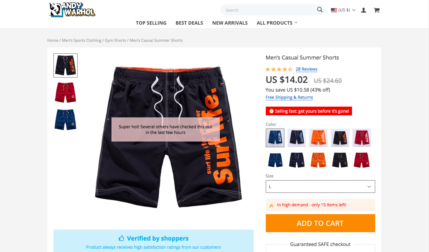
Clearly, the design and layout of this page is fully oriented on purchases generation as well.
Here, you see 4 purchase motivation elements (you can flexibly customize them according to your personal preferences):
-
High demand pop-up
When the store visitor opens a product page, a “Super hot! Several others have checked this out in the last few hours” pop-up appears for a few seconds.You can set up its length of stay and make it shown for long enough to make the visitor feel more interested in this product.
-
Urgency banner
The red “Selling fast: get yours before it’s gone!” bar is brief yet impressive. Combined with the pop-up, it makes the viewer believe the offer is actually limited. But, unlike the pop-up, it doesn’t disappear. It sits right there, under the product price, influencing the visitor’s decision-making process. And, again, you can customize its text, color, and icon, and even insert a .gif file.
-
‘Products left in stock’ banner
The previous two elements were all about emotions. This one, however, seems to be appealing to the rational side: it shows the exact (kind of) number of the items left in stock. So, the visitor understands that the claims of a high demand and fast selling weren’t false: the product is truly going out of stock, so the best time to take action is now. To make it look more authentic, you can specify a range of ‘left in stock’ products: the system will randomly choose a number within this range, and it will seem more true-to-life to the visitors.
-
Trust banner
The large blue “Verified by shoppers” banner is an essential element of the social proof you should definitely have in your store. Sellers can say whatever they want about their products, but the most relevant information will anyway originate from the buyers, right?
Now, let’s scroll down to see what else is put on Andy’’s single product page.
The further details mostly refer to the organizational aspects of online shopping, but even they are persuasive enough.
-
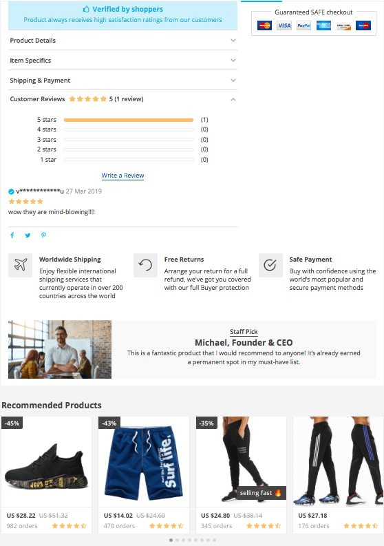
Product details and reviews
By default, the Customer Reviews tab is shown expanded, while all the other tabs are folded. This, once again, was designed to give the right impression: other people have a positive experience of ordering from here, and they are happy with the product.
-
Safe checkout
In online shopping, it’s vital to be sure that the site you’re buying from is secure and trustworthy. That’s what the ‘Guaranteed SAFE checkout’ field is for!
Here, you show your visitors the supported payment options, and assure them that their orders are in good hands. Feel free to replace the default icons with any other security-related icons at your choice.
-
Social networks icons
How can your store visitors spread the word about an amazing product they’re about to buy? Through social networks, of course!
Tiny Facebook, Twitter and Pinterest icons let your store viewers share the item page with their friends, ask their opinion, and, quite possibly, attract even more visitors to your store.
-
Terms and conditions explanation
Let’s be honest: during online shopping, almost no one reads the Terms and Conditions page – it’s boring, and it’s not always easy to find!
To make your online store more customer-oriented, we put the most important purchase terms right on single product pages – there, they are hard to miss.
-
‘Staff pick’ field
Do you want to give an extra ‘reputation boost’ to some of your products? Why not pretend your company employees personally recommend them?
Even if your business has no workers other than yourself, you can post these recommendations in your own name 🙂 In the ‘Staff pick’ field, you can post a photo of a person leaving the feedback, their position in the company, and a short review.
-
Recommended products
Do you want your store visitors to buy a single product from you and leave your store after placing a tiny order? Or, would you rather prefer your buyers to buy a bunch of items in one sitting?
The “Recommended products” section is a blessing for you – and for your customers! For them, it’s a source of ideas to check while staying in your store. At the same time, for you, it’s a chance to increase your average order value! How about giving it a go?
Are you already willing to build a profitable online store with the Andy theme?
AliDropship Andy theme is the perfect solution for you if you want to:
- Focus your store visitors’ attention on your outstanding product offer
- Speed up their decision-making process
- Make your visitors stay longer and recommend your store to friends
- Inspire trust and make an impression of a secure shopping destination
- Enjoy a growing volume of sales
Is that what you’ve been looking for? Don’t wait for a second longer!
Buy AliDropship Andy theme from its official page, and don’t forget to check out its detailed customization guide. This is how you’ll give your profitable online store a special look – and turn lots of your random store visitors into happy buyers!
tutorials and special offers from AliDropship
Recommended for You


I’m an existing AliDropship customer, bough customer store few months back and many other plug-ins. I’m currently using da’vinci theme for my store. What will be the impact of switching themes, if I have to switch to Andy theme… Thanks.
Hi, thank you for your question!
If your store is based on AliDropship Original plugin (not the Woo version), you can switch to it safely. To do this, we recommend you to use the special Theme Switching service: /services/theme-switching/
The thing is, when you switch themes, some part of your individually created store information gets lost. Our specialists will help you configure the store settings in the right way.
Is there an Andy woo commerce version? Or Andy has already accommodated woocommerce numerous payment gateway? Please speak.
Awesome theme, nice and clean design. Probably one of the best themes for dropshipping!
Are you going to have this theme but on Woo commerce?
Hi, thank you for your question!
As for now, there are no plans to make a Woo version of Andy, but we’re grateful for your feedback!
Hi, In struggling to get started, various ideas and forms I’ve looked at. Products mainly told niche only, general stores are history. I ordered some ear bud head phones from China, Alibaba, came in Chinese, instructions in Chinese, Programmed in Chinese. It deterred me from the electronic market. Time in shipping was long. Can you reassure me of better prior to investing.
Regards Ricch
Hi, thank you for your interest! Our dedicated team member will get in touch with you soon.