Da Vinci 2.0: New Profit-Oriented WordPress Theme for AliExpress Dropshipping Stores

Why does it matter what WordPress theme you use in your AliExpress dropshipping store? Because the better your store looks, the more sales it generates!
Today, we will talk about new, customer-friendly AliDropship theme. So, let’s give a round of applause for Da Vinci 2.0!
You probably remember our Da Vinci store theme.
Historically, it was the first theme we have offered to our plugin users and custom store buyers.
It is so good-looking and appealing to visitors that most of our clients choose it for their dropshipping stores. Plus, we actively use it ourselves: most of our self-owned stores are based on Da Vinci. And, these online stores have a great performance! This is why we can be sure that the Da Vinci theme is efficient and well-working.
However, many years have passed since we introduced this theme. For this reason, we decided to take the best from the original Da Vinci theme, and improve it!
Now, we are proud to announce Da Vinci 2.0 – a new WordPress theme for AliDropship stores that combines time-tested solutions with cutting-edge tricks!
Why is Da Vinci 2.0 such a great WordPress theme for AliExpress dropshipping stores?
So, Da Vinci 2.0 (you can view it in detail here) is an awesome WordPress theme for AliExpress dropshipping sites that are built with our plugin.
Please note: this is not an update to the original Da Vinci! It is an independent theme!
You might ask: why is it so special?
Here are the most significant and valuable features of this theme!
Minimalism
Don’t worry – all the vitally important buttons, links, and tabs are still here. We are not getting rid of essential website elements!
However, we locate these on-site elements in a carefully thought-out way. This way, the pages on Da Vinci 2.0-based websites don’t look overloaded and confusing – instead, they are neat and tidy. The visitors can find the necessary information easily, and they don’t get lost in the navigation.
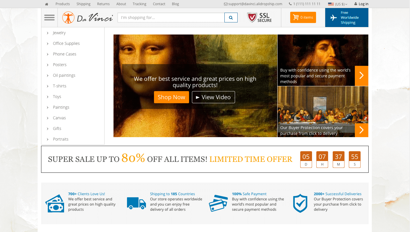
To understand what we’re talking about, look at the screenshot below – it’s the layout of a homepage on the original Da Vinci theme.
Yes, it’s cool – it’s catchy, decorative, and highly entertaining. Still, it can be done in a different, equally (or even more) efficient way.
Here it is – look at the same page layout on the Da Vinci 2.0 theme:
You can almost feel the difference, right?
The content is the same, but the way it is presented is strikingly different. The new version has much more clean free space, less details that require the viewer’s attention, and a very comforting ‘tone’ overall. Obviously, it has a huge importance for our next point!
Keeping the visitor focused
A human attention span is really short, and it literally takes you seconds to lose your focus.
In our new Da Vinci 2.0 theme, we did our best to put the product into spotlight and make sure it’s not overlooked.
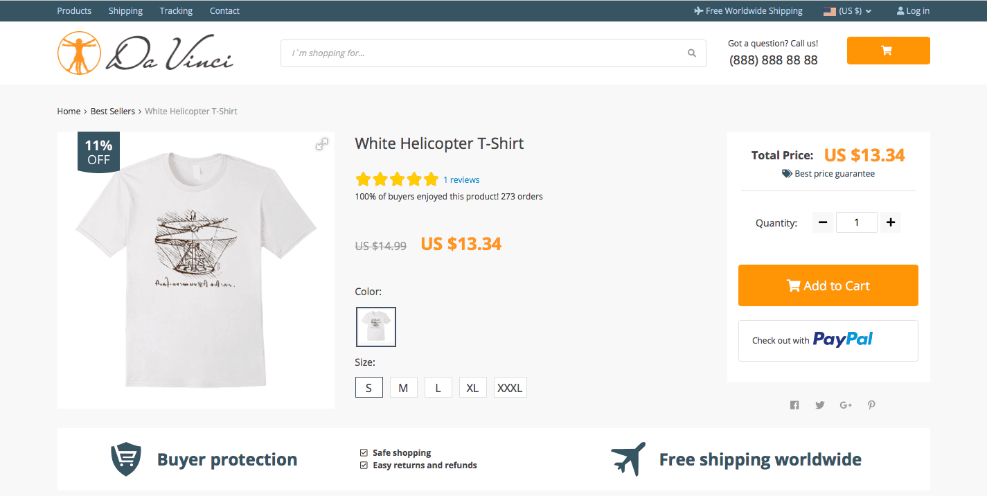
Here is an example of a single product page in this theme:
As you can see it here, not a single element on this page distracts the visitor from the product.
For this purpose, we have increased the size of the main product picture, changed the way the price is displayed, and designed a clear “Add to cart & check out” box. All these tiny steps are vital if you want to grab your visitors’ attention and guide them towards completing the order!
Purchasing motivation
Right now, you might be wondering: why would the product page viewer complete the order, after all? What should you do to make the visitor click the ‘Proceed to Checkout’ button?
Psychologically, there are numerous tricks that can speed up the decision-making process. In the Da Vinci 2.0 theme, we use some of these methods.
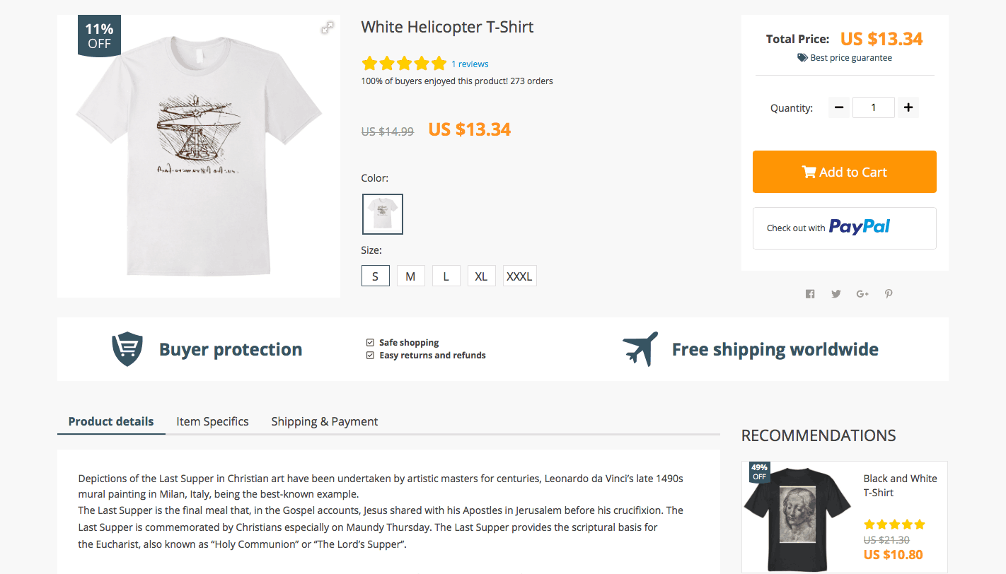
Let’s take a look at a single product page once again – now, from a slightly different angle.
The first thing that the visitor sees is the sale badge (“11% OFF”) placed directly on the product image. You probably know that elements placed in the top left corner of reading/visual materials are the first ones to grab our attention. Here, we use this principle to make the buyers believe they can make a good deal.
Another important element is the Reviews link. Right after the product name, customers can see how much did the previous buyers like this item. That’s vitally important for quality social proof!
Besides, the Reviews link is clickable, so the page viewers can use it to go straight to the feedback section on the same page of they are interested.
Finally, in the Recommendations column, your store guests will see up to 5 related products that can make a good match with this exact item. Surely, it’s a great way to give your clients more shopping ideas and increase your average volume of orders!
Smart interaction with customers
You certainly know how annoying it is when you can’t complete an important process on a website because of its inconvenient structure or unclear directions. Imagine how many potential buyers you can lose because of a poor user experience on your website!
Luckily, Da Vinci 2.0 theme doesn’t simply provide a smooth operations flow. In a way, it also cares for the website visitors, and lets them know they are welcome and valued in the store. Surely, it only creates the best impressions about the business!
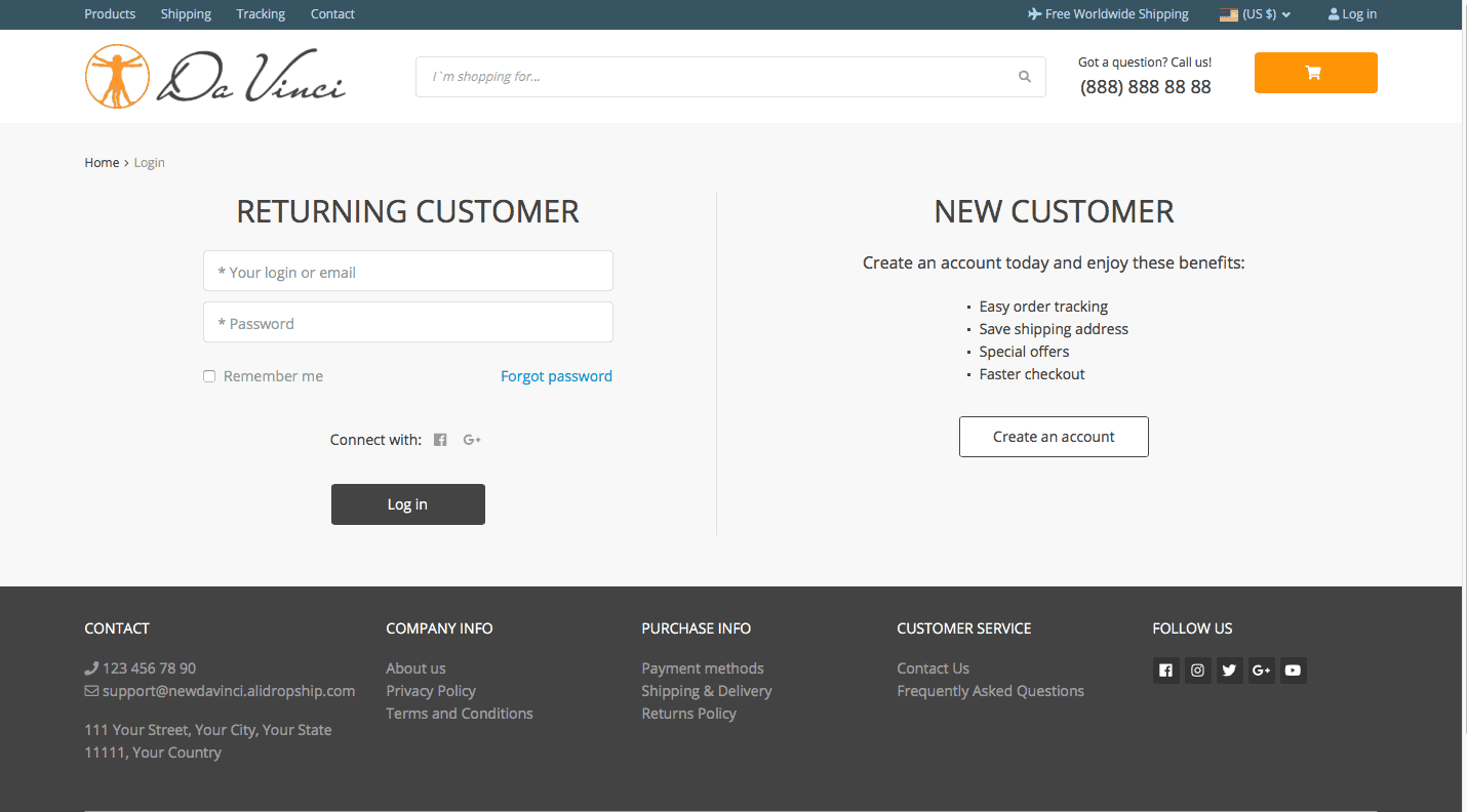
It all starts with the login/register page: whether the user is a new visitor or a returning customer, it is easy to figure it out how to log in and proceed with shopping.
It was also important for us to make sure that all the other on-site systems are conductive and understandable.
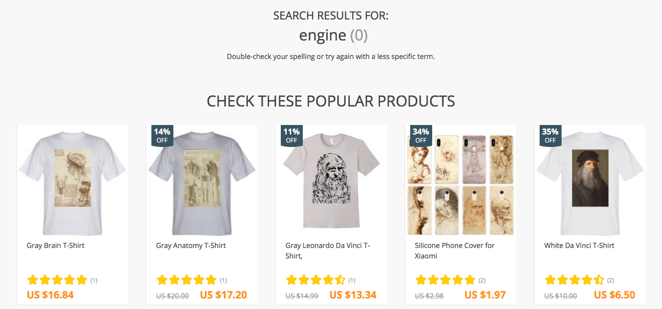
For example, if the store visitors look for something that is not featured on the website, they won’t simply see a plain ‘sorry, no matches found’ text or something. Instead, they will see recommendations on their search wording. Besides, they will also see 10 best selling products from the store – maybe, it will inspire them on impulse purchases!
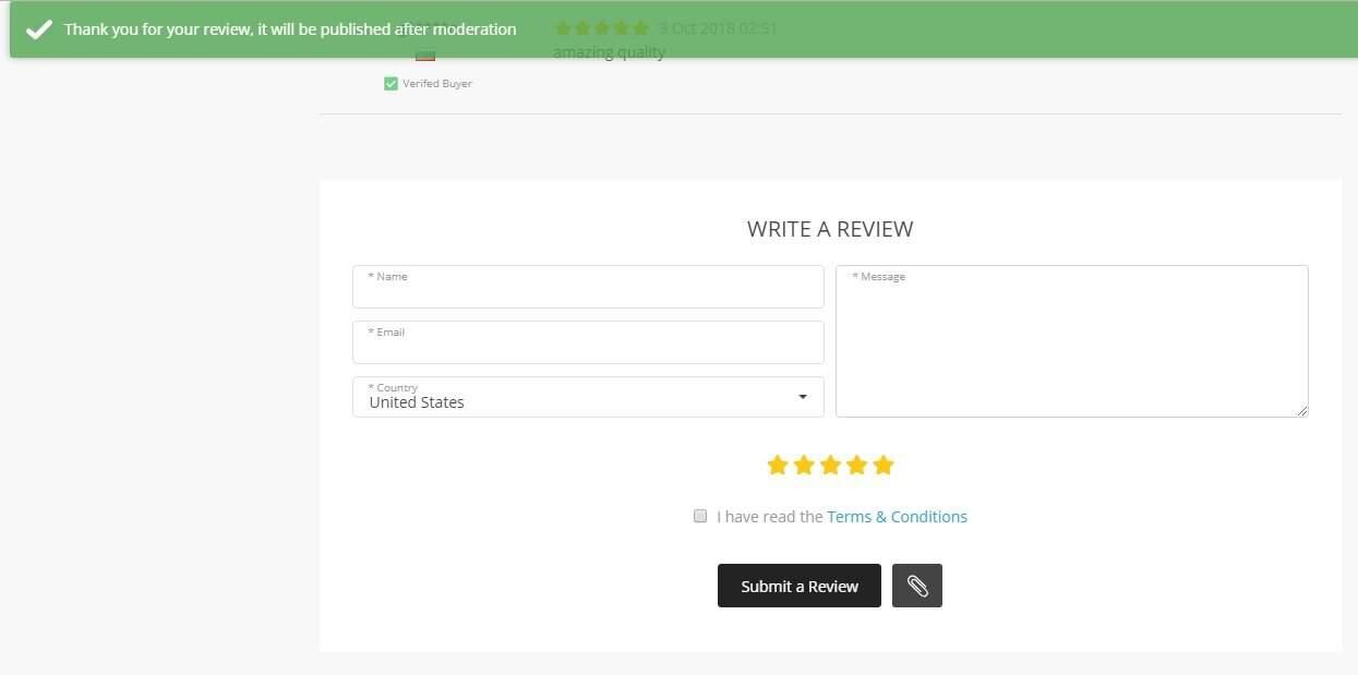
The attention to customers’ input can also be seen in the way we treated the new “Write a Review” forms on single product pages. After the buyers leave their feedback, they see a “Thank You” notification that definitely proves their importance for the store!
Orientation towards buyers
As you have probably understood it by now, the whole Da Vinci 2.0 theme is centered around the buyers. Clearly, its aim is to provide a smooth shopping experience and urge the visitors to come pack for more purchases!
So, it doesn’t simply create a clean, well-structured website that meets the modern standards and looks relevant. It shapes a welcoming, supportive environment where every visitor feels valued and appreciated. Isn’t it what we all want, after all?
Let’s go over the major benefits of this WordPress theme for AliExpress dropshipping stores once again!
Summarizing all the mentioned Da Vinci 2.0 features, it’s safe to say that this theme:
- Makes it easy for Internet users to navigate and use your webstore
- Prompts impulse purchases and spontaneous shopping decisions
- Helps you develop a strong brand that gains customers’ loyalty
- Lets your customers see how much you value them
- Ensures a smooth and profitable performance of your store in the long run
Now, you’re probably wondering how to get Da Vinci 2.0?
It’s really simple!
Once again, it’s not an “update” to the original Da Vinci – it’s a totally independent theme that should be installed separately!
To get this theme, simply click here and press the ‘Download theme’ button. Follow the theme installation guide if necessary.
After this, feel free to use the theme customization guidelines to create a unique and appealing shopping destination.
That’s it!
Now, you’re ready to proceed with your awesome business. Don’t forget to leave your feedback in the comments’ section below!
