How We Created A Product Page That Made $3,813 In 7 Days [Case Study]

In online business, it is important not only to create eye-catching ads and promote products to proper audience. What also matters is how an ecommerce product page looks.
Facebook advertising has proved to be a very efficient way to drive potential customers to your ecommerce website. When seeing an interesting product or a tempting offer in social media, people often go to the site and make impulse purchases.
However, before pressing the Add to Cart button, they see your ecommerce product page. And this is where you can easily lose clients if the page doesn’t look good!
Why is ecommerce product page design important?
A “good” product page doesn’t only mean a “visually attractive” one. It goes without saying that a product page must look neat and tidy. But there are other small nuances that can either push a visitor to purchase the product or lose interest and leave the site. These might include:
- Similar product suggestions for upsells and cross-selling
- Product videos
- Page optimization for a uniform look and better SEO ranking
- Social proof elements
A properly designed ecommerce product page helps visitors make their purchasing decisions in an instant. It provides them with smooth and pleasant shopping experience and encourages them to come back late for more purchases. So, winning ecommerce page design can increase conversion rate – as well as your overall profit numbers.
How do we work on ecommerce product page design at AliDropship?
Let’s discuss profitable product pages in more detail!
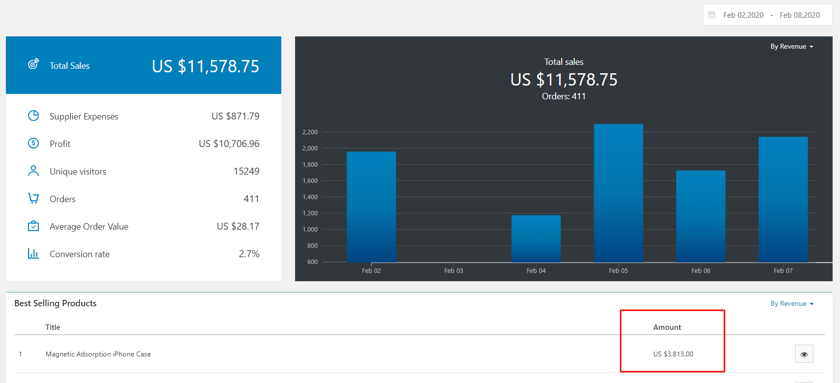
We are going to analyze the product page of one of our own dropshipping stores which we advertised on Facebook. Look at the screenshot below: as you can see, in just 7 days, this product made $3,813 in sales!
Certainly, it wouldn’t happen without a proper Facebook ad, but if it wasn’t for a good product page, the results wouldn’t be so great.
Step #1: Put the product in the Best-Sellers section
All products in an online store are distributed among categories. The product we advertised is located in the Phone Accessories category, but we also placed it in our Best-Sellers section. Why?
First of all, this move has a certain psychological meaning: if you advertise the item as one of your most popular deals, prove it by placing it in the corresponding category.
In addition, if a user clicks on your Facebook ad, lands on the product page but then goes to other categories, it may help bring them back to the item when they see it again in this category.
Now let’s see how the product page looks.
Step #2: Find good-looking product images
People perceive 80% of information through their eyes. That’s why visual content serves as a powerful tool to grab attention.
Remember, after clicking our Facebook ad, users get to the page. They’re interested, but it doesn’t mean they’re definitely going to make the purchase. We still have to convince them the item is worth it.
That’s why, when creating this ecommerce product page, we used high-quality pictures. This is the first thing customers are going to see, so a blurry or pale image can disappoint and scare them away.
Furthermore, make sure the photos show the product in details, from different angles or in use. A video or a gif would do even better. When shopping online, people can’t touch goods, which is why images must compensate for this disadvantage.
Therefore, when deciding what products to dropship from AliExpress, always pay due attention both to the quality of pictures and their informational value for a potential client.
By the way, one and the same item on AliExpress can be sold by different stores, so you can copy images from other sellers.
Step #3: Edit the product title
As you know, AliExpress goods have lengthy and sometimes confusing titles, which is why it is a must to change them to more eye-catching ones.
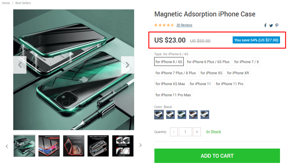
In this case, the team changed it to a simple phrase consisting of four words – “Magnetic Adsorption iPhone Case”. Short and clear titles work best because people understand what they’re looking at right away.
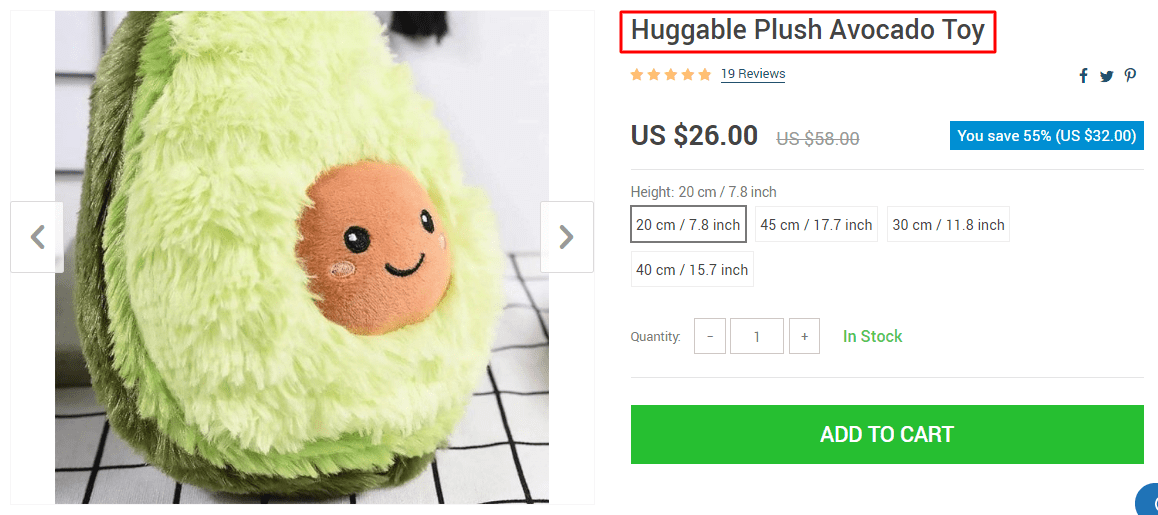
We usually avoid using evaluative adjectives such as “amazing”, “cool”, “great”, etc. as they often feel as self-applause and don’t really describe anything. On the other hand, some of them can work really well if a product is meant to evoke emotions. Take a look at this item.
The word “huggable” has a definite descriptive meaning, but there’s also some degree of evaluation, which is Ok because… just look at this cutie! 😀
Step #4: Work on the Add to Cart button
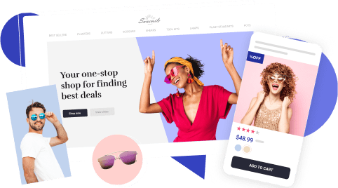
The Add to Cart button is one of the most important elements of any ecommerce product page because it works as a call to action. That’s why it should be large and clearly visible.
As you can see, we made it big enough. Besides, the button’s color is different from the site’s general palette, which makes it more distinctive.
It’s not uncommon for online shoppers to leave websites empty-handed simply because they can’t find the Add to Cart button at first glance. They quickly get irritated, lose interest and leave the product page in just a few seconds.
Step #5: Duplicate discounts on your ecommerce product page
During the advertising campaign, our team offered this product with a 50% discount. Quite often, it is the opportunity to save money that makes people click on an ad. Although most of them know there’s a discount, it’ll never hurt to remind them about it.
Moreover, on our product page, customers can see the previous price and how much they can save.
Step #6: List product specifications
Some people may want to learn more about a product before making a decision, so they’ll scroll down to see the detailed information. What kind of information you place here depends on the type of product.
For example, clothes require a sizing chart. Certain electronic goods require such details as voltage, memory capacity, etc. In our case, we decided not to show the product’s specifications as there’s not really a lot to show. Instead, we made a list of benefits customers get when they purchase it.
Step #7: Write product descriptions
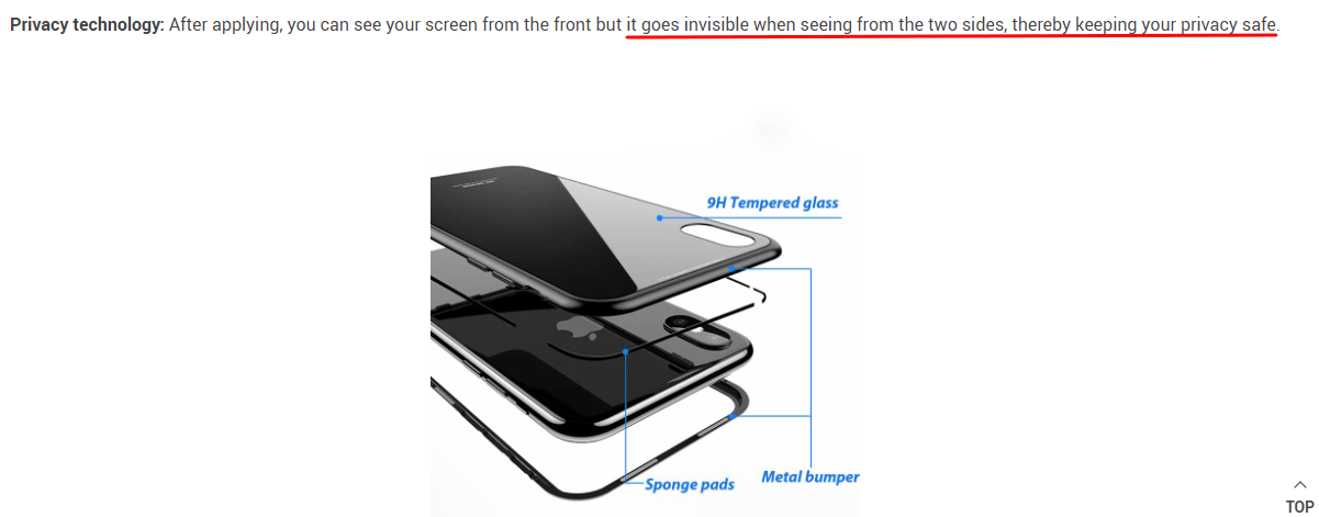
When describing a product, you want to mention all the benefits clients can get. On our page, we did it by telling people how this particular product can solve a particular problem:
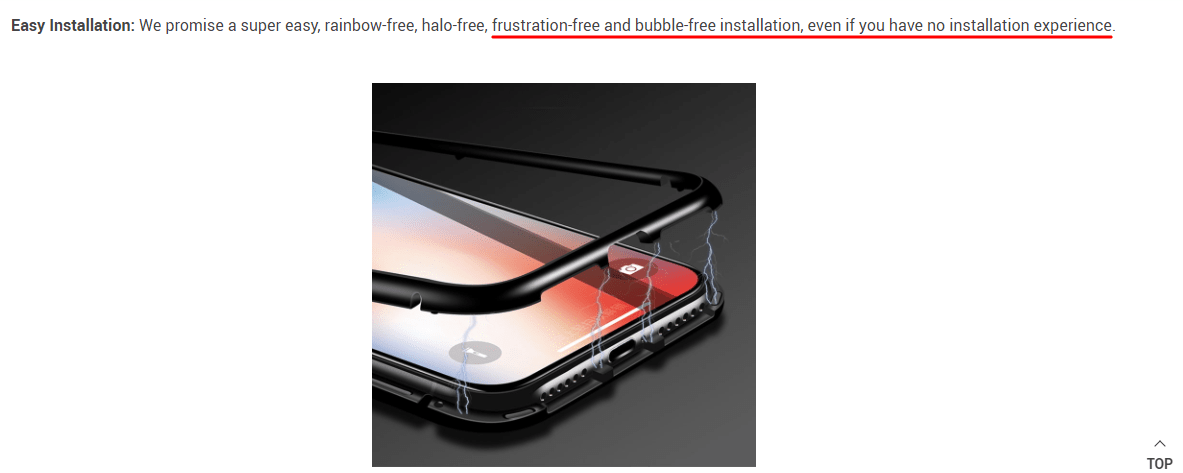
It’s also a good idea to anticipate potential questions and doubts:
When composing the description, the team combined large photos with short text fragments.
As you remember, most site visitors that come from our Facebook ads just got interested and don’t want to read long paragraphs. Instead, they want to see product photos and short explanations on what it is.
As I already mentioned, certain product types can benefit a lot from videos or gif files since this way visitors can better see how the item works. So, if possible, place them at the top of the description.
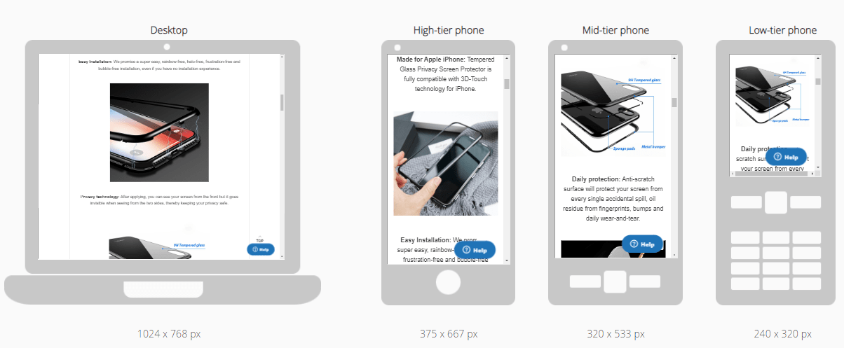
Finally, we made sure the description looks good on mobile devices as most purchases come from them.
Step #8: Look through customer reviews
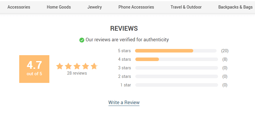
After the description, customers can see reviews left by previous buyers and the product’s overall score.
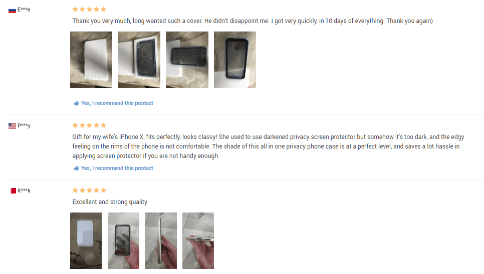
Note that not all of the imported reviews have 5 starts since nobody would believe this. So, a number of 4 or even 3 star reviews will persuade potential clients that these are more or less reliable. Just make sure such reviews don’t criticize the product itself but rather touch upon minor, unimportant inconveniences.
Also, import as many reviews with customer made photos as possible since it will show site visitors the real quality of the goods.
If you dropship worldwide, try importing reviews left by people from the U.S. and European countries because customers tend to trust their opinion more.
If you can’t find proper reviews on AliExpress, visit Amazon. Its sellers often resell the same goods and buyers are pretty active there when it comes to commenting. Also, don’t mind misspellings and mistakes: they make reviews look more natural.
Step #9: Check your ecommerce product page speed
When someone clicks on an ad, he or she expects to quickly look the page through. But if loading takes too long, they’ll leave. Therefore, page speed plays a very important role in converting visitors into buyers.
To provide sufficient speed, make sure to compress all images on the page. The size of the page should not exceed 2-2.5 MB. Our result was 1.72 MB.
You can check the result by using services such as GTmetrix. Other services such as Page Weight can help you optimize pages. Images are usually the heaviest type of data. Page Weight analyzes your page and tells you which images require optimization. These services are what our team used.
Each of these steps improved our product page in order to engage potential customers into learning more about the item and quickly convincing them it’s worth buying. Of course, a product page cannot make a lot of money by itself. But optimizing it is absolutely necessary if you want to make your ads more efficient.
Want to use our team’s experience and benefit from excellent ecommerce product pages? Import any of the stellar-looking pages straight from our Sellvia Catalog of bestselling products — and get fast US shipping as a lovely bonus!


![How We Created A Product Page That Made $3,813 In 7 Days [Case Study]](/wp-content/uploads/2020/03/Add-to-Cart-button.png)
