Product pages that convert
A product page can work as the perfect landing page if you do it right, did you know that? And good news! The art of product landings in ecommerce is far more attainable than most ecommerce newcomers think.
Stop thinking of it as a long book you need to squeeze into a short webpage, seriously, stop that mania for long texts. It won’t make people purchase if you explain every little detail of your product, no one cares, DUH.
Let’s learn what it really takes to make a landing page that converts visitors into buyers in a few seconds (yes, you’ve read it right, seconds!).
First, imagine entering a boutique and being ushered into a special room dedicated to showcasing one exquisite item. This is the essence of a product landing in the digital realm.
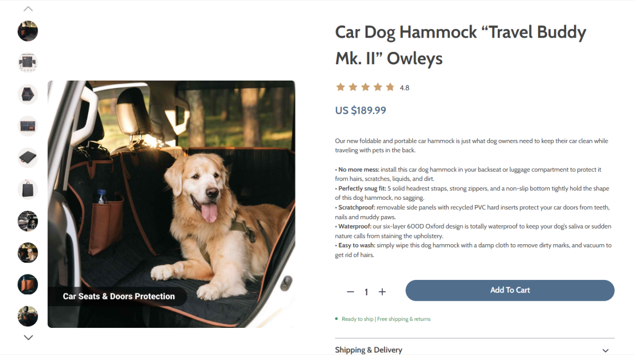
A product landing is a focused web page built to highlight a single product. Instead of a shopper aimlessly wandering in an online store, they’re guided directly to this space, which beams with details, specifications, and appeals about the product.

Why is it crucial in the sales funnel? It’s your pitch room. By the time a visitor is on a product landing, they’re already interested. The landing’s job is to convert this interest into a purchase by addressing every possible query or concern the visitor might have.
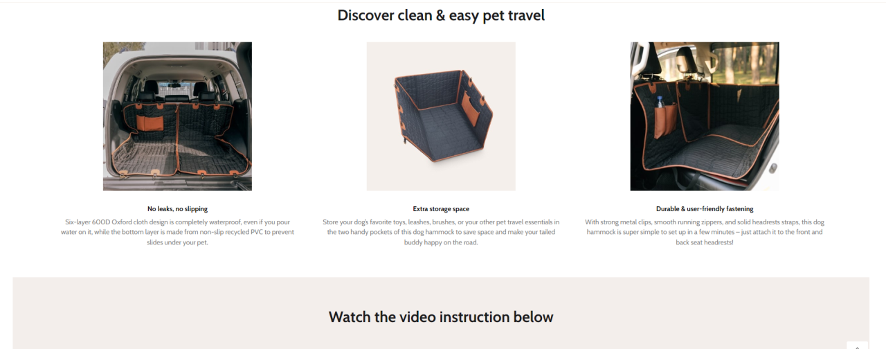
Visually, product landings are typically clean and intuitive. High-resolution images, maybe a demonstration video, key features, and a prominent ‘buy’ or ‘add to cart’ button are all part of the ensemble.
Creating one involves blending design aesthetics with effective sales strategies. It starts with understanding the product and the target audience, then crafting a narrative around these insights.
Installing The Owleys Travel Buddy Mk. II & Dog Seat Belt 🐶
Videos perfectly support any product landing, for example, this one devoted to a Car Dog Hammock by Owley’s
All in all, principles of a high-converting landing are the following:
- Simplicity: Keep it clean. Avoid clutter. Highlight the essentials.
- Clear CTA: A distinct ‘Buy Now’ or ‘Learn More’ button that’s easily visible.
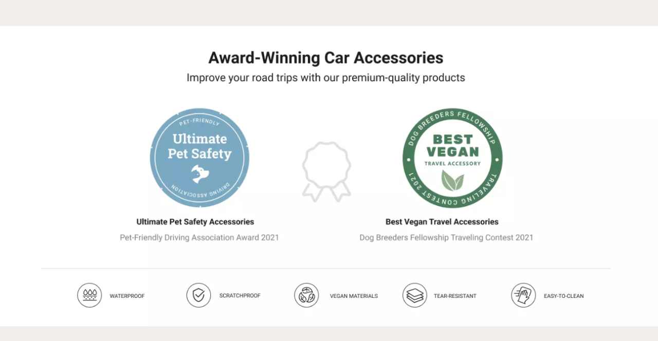
- Trust Indicators: Showcase reviews, ratings, or any endorsements.
- Swift Loading: Speed is of the essence. Ensure a smooth and fast browsing experience.
- Mobile-Ready: It should be as appealing and functional on a phone as on a desktop.
In the vast ocean of e-commerce, product landings are like lighthouses, guiding potential buyers to safe shores, ensuring their journey is direct, informative, and persuasive.
Properly crafted, they can be the difference between a mere visit and a confirmed sale.
Got it? No worries if you didn’t, we can’t leave you without a bunch of brilliant landing examples.